JNY Studios - a new step in my career

I’ve had my new space for 6 months now, and it’s finally getting to where I pictured it when I initially saw the space.

It’s amazing to have my own space that I am able to use, I loved my old one in Birmingham but the extra space that I now have is just insane. I’d say it is about 4x bigger than what I used to have.

I have dreamed about a space like this for years, debating names to call the space itself as I want to market it separately from myself as a photographer. Just before getting the space, I finally settled on the name ‘JNY Studios’. I want this to be something that I can grow and develop and move as and when I need to. To start with, I made a new website for the studio:

https://www.jnystudios.com/

From what I’ve seen, Leeds has some great studios already, but I believe there’s a gap for an affordable studio, basically in the city centre, with decent and plenty of parking. JNY Studios can be that studio.

Oh, and I have a roller shutter on the space so it’s super easy to get your kit in and out if you need to, you can literally get a van in there.

I want JNY Studios to become a community where people not only collaborate, but refer work between each other and push each other in creative ways. We all have our own voice and style, and we can all learn so much from each other. I want to be able to celebrate creatives and their work on my social channels and website and share work that people have created in my space. I think it could be amazing, and I believe it will be.

Whether you're a photographer, videographer, painter or just about anything else, JNY Studios provides the perfect space to explore and experiment your craft. We offer 4x bowens heads with each rental, along with many different modifiers, various backdrops and other accessories you may need on a shoot.

Commissioned Piece of Artwork

At the start of March 2021, I was asked to create a piece of art as a leaving gift for a member of staff who is leaving Sir John Deane’s College at the end of the academic year. There was a clear idea of what was wanted and there were some stand out areas of the college that I was asked to include somehow. 

I was able to spend time around the empty college during the Easter Holidays. I was super lucky with one of the days and I was able to shoot with a mostly cloud free sky - the blue complimenting the red colour of the exterior of the college, both the old brick section and the newer modern section.

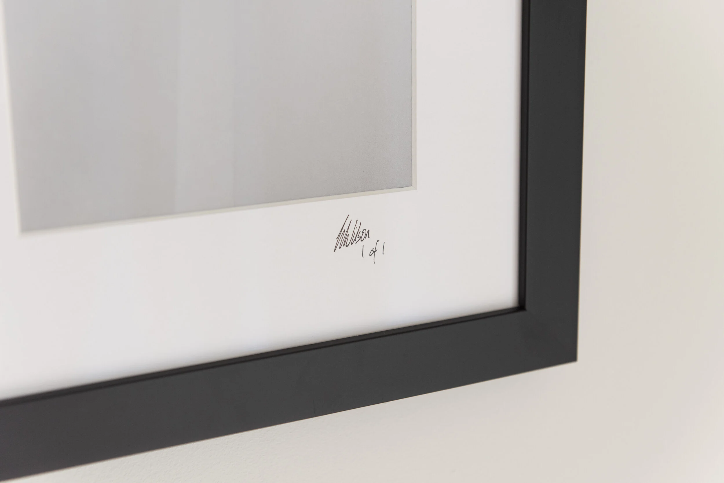
The final piece that I created and was gifted on the 9th July. It’s about 100x60cm in size and I couldn’t have been happier with how it turned out. It has a nice mix of personal moments for the recipient while more generally to others, it is quite clearly Sir John Deane’s to anyone (if you know the college).

With my career and work being based around product photography usually, seeing my work printed, framed and up on a wall isn’t common. However, seeing the reaction of the client to something like this is something that is genuinely so special and I am sure that it is something that will never disappear throughout my lifetime. I picked up the framed picture the day before it was presented and I was almost sad for only being able to see my work in it’s final state for less that 24 hours - but seeing the reaction of it being seen for the first time by my client hugely outweighed any feeling of sadness. 

I just love knowing that it will be hung on the wall for years to come at someone’s home, I love knowing that people will ask about it when they see it and that there will be an interest in both the meaning behind the art work and in the photos themselves. I had it hung on a wall at my home for me to see what it will look like (and to take these photos) and while I was looking at it I just felt so proud.

A massive thanks to Mark at Art of Framing in Nantwich for doing such a wonderful job with the framing. He made the process so easy and stress free. Link to his site is here.

Finally, obviously a massive thank you to Sir John Deane’s for commissioning the piece from me. It was simply a pleasure creating such a personal piece of artwork.

Finishing off my image of an Arnold & Son watch

I took the photos for this image nearly 6 months ago, luckily it was only a personal project, so there was no rush for a deadline. I edited it at the time but I felt like something was missing in it so I left it for a while and didn't upload it anywhere until I found the thing that was missing.

The original edited image - it’s nice and clean but just felt a bit empty

The original edited image - it’s nice and clean but just felt a bit empty

Last week I gave an online lecture to the students on my old course at Birmingham City University. While looking through my hard drives for images to show during my presentation, I found an image of stars that I took when I was on a job in Italy back in 2017 and I knew that it would work perfectly as a subtle background for this image.

As soon as I added it in I knew it had finished off the image. I then found a light leak that I had put aside when my camera mechanism went wrong (also in 2017) and used that for some colour in the image - I felt it looked a little like the colours of a nebula.

It's turned out to be one of my favourite watch photos I have made, I'm glad a didn't rush it - and it has made a perfect background for my computer!

The stars image (they are there)

The stars image (they are there)

The light leak

The light leak

The finished image

The finished image

My favourite B&W photo I have taken and the story behind taking it

A while ago I was asked what my favourite black and white photo that I had taken was and I knew instantly what my answer was. Black and white images aren’t that common for me - my images use colour to compliment the product I am shooting. Also, products are usually designed with colours in mind - so it's not right for me to then remove them by making an image black and white. So, with this in mind, the image is inevitably one that is out of my usual genre of photography. It is this image below:

NY029.jpg

I saw this corridor while I was in New York which was the entrance to a restaurant - the glass on the left is the wine cellar - and I saw this host stood at the end of it. I had my Leica M6 with me (with HP5 film for those who are interested) and I went to set up the shot and just as I was about to shoot it, she walked off. I stood there for about 3-5 minutes just waiting with it all composed, leaning up against a wall to stay out of the way, with other people coming in and out of the frame. The scene then all cleared perfectly in time for her to come back from the left hand side behind the glass. She spun around to the little podium she was working at and this made her dress flick out slightly adding a subtle amount of movement to the image, and there is a tiny gap between her arm and body which gives her body shape to the viewer.

Something that I hadn’t seen at the time of shooting is how her reflection is then distorted in 3 different ways - a very clean but broken reflection in the glass on the left, a wavy slightly lighter reflection in the floor and then one that combines these two.

As soon as I clicked the shutter I knew I had captured something and I spent the rest of the trip excited to get back and develop the rolls of film so that I could see the image. I remember developing the film and just pulling out the film from the spool and just looking for this image and being so happy when I could see it had come out. I then printed it in the dark room the following week and the print was stunning, it now hangs proudly in my dad’s house. This Christmas, I gave another print of this as a gift which is what prompted me to write this.

Deakin & Francis

Deakin & Francis® designs and makes the world’s finest cufflinks, signet rings, gentlemen’s accessories, ladies jewellery and bespoke commissions. Deakin & Francis is England's oldest family jewellers, founded in 1786 and across seven generations D&F continue to build on the heritage, brand and family values that have been created over the past two centuries.

Deakin & Francis produce fine quality, hand-made jewellery in precious metal, vitreous enamel and gemstones. Through world wars and recessions, changing fashions, seasons and trends, the brand has adapted to the demands of their clients. Today, D&F’s team of highly skilled craftsmen (and women!) continue to deliver beautifully designed products of the highest quality.

I’ve been working with D&F for nearly a year (I know guys, seems like yesterday when we first met) and I have been fortunate to witness the whole process of the creation of their pieces over this time. I am constantly impressed by the level of detail that goes into their pieces and I have seen some incredible items.

The GIF I made of the moving jaw

The GIF I made of the moving jaw

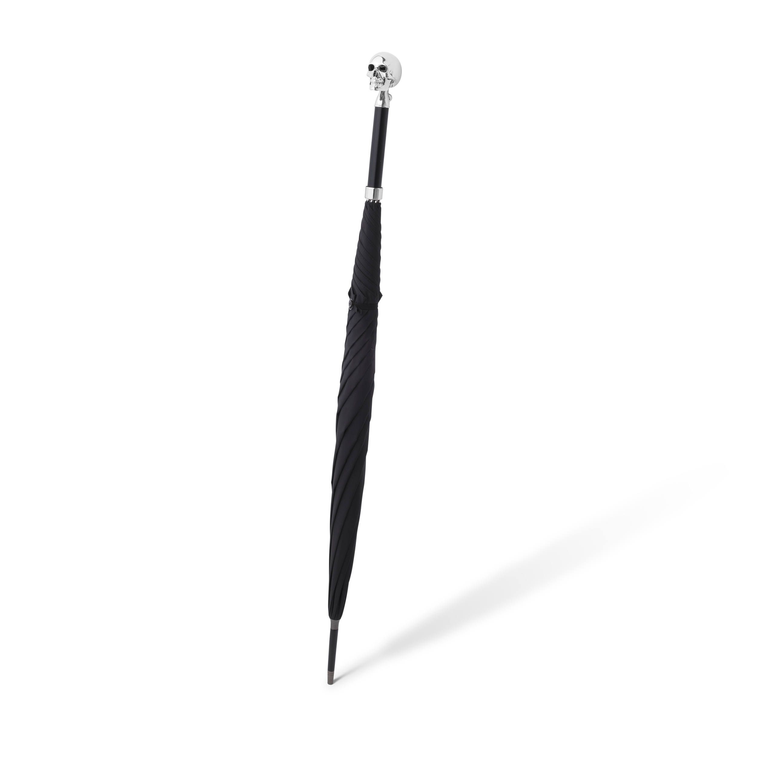
I was once tasked with the job of making a GIF showing the moving jaw element of a skull on an umbrella. The result perfectly shows how it all looks, including the hidden surprise of a pair of red eyes dropping down at the same time. It was a huge test of my problem solving (something that I love to do), as I needed to make up the image with individual edited stills, and the GIF was made up of about 10 individual photos in total - which were then reversed so that the jaw closed again. 

And yes, you read it right above, this is at the bottom of an umbrella, just one of the many surprising items you would find at D&F. They look amazing in both silver and in matte black, personally I would go for the matte black one though. Just personal preference if anyone is looking for a present for me ever!

These skulls can be found on corkscrews too. Imagine having one of these to open a bottle of wine with! It definitely wouldn’t be a corkscrew that would be thrown in a drawer somewhere , it would probably be on display more than the bottle of wine you’re about to drink was…

Skull CorkScrew_.jpg
Umbrella
Skull CorkScrew.png
London
NY

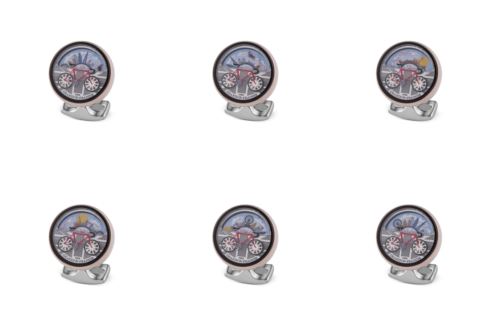
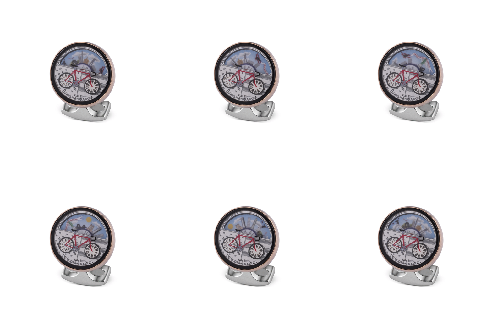
I also made GIFs of some cycle cufflinks made by D&F. I’d say these GIFs were actually a little bit more tricky for me to make as they were much smaller and they move by twisting the outside of the cufflink, so I had to do this millimeter by millimeter without moving the cufflink too much so that I could use the parts that moved in the editing process. I worked hard on starting/ending the gif seamlessly so that they would loop indefinitely and the viewer would not be able to see the cut in it. The final results can be seen above, both featuring the landmarks from London and New York, with the UK/American flag featured too. How cool are they?

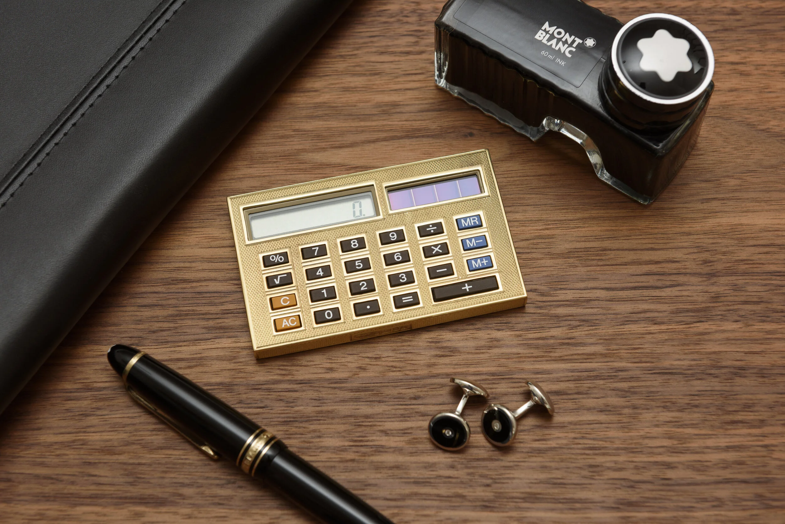
On top of these pieces, I also photographed the most expensive calculator in the world with D&F. It was made with 18ct gold - just like many items you can find at D&F. Feel free to go and find it on their website for a price. The relationship I have built up with D&F over the past year though allows them to trust me to handle such a piece to shoot.

18ct gold calculator

18ct gold calculator

Over the past year though, I have photographed lots of products with D&F for their website. I pride myself in consistency with the e-com work I do for them. Each job can be weeks apart, but I will provide images in exactly the same look and style as the previous job - all lighting powers are the same, camera settings, height of the camera in comparison to the products, everything. This means that D&F know that they will be receiving images that consistent with the rest of their website - something that is key for brand image and, in my eyes, makes browsing a website much more pleasurable. If you scroll through a website and all photos are at a different angle, different brightness, some are blurry, the colours are off, etc., then it is really noticeable when they are next to each other. My work and attention to detail means that D&F will never have this problem.

I can’t wait to see what else I see come out of their workshop over the next year.

https://www.deakinandfrancis.co.uk/

PS. We have an advert coming out soon, keep your eyes open for updates!

Just some of the e-com photos I have done with D&F over the past year.

Just some of the e-com photos I have done with D&F over the past year.

Making my own Canvas Backdrop

I saw textured backdrops being used by some photographers that I loved - Jan C Schlegel, Dayron Vera, Clay Cook and the most famous user of a backdrop like this of course, Irving Penn (his was used for over 50 years). I felt that they looked so much more raw and interesting than a normal paper backdrops that are available to buy. There is a character to them that adds to the photo in such a subtle way, but it is insanely effective. I had found some amazing companies making these kind of backdrops, one of my favourites is Unique Backdrops - however, as I am just starting out, they were a little out of my budget, so I decided to try and make my own! I have linked all photographers/companies I have just mentioned down below.

Now I totally understand that the use of this will be completely different from what I usually do, but I just wanted to try my hand at it. I follow some absolutely amazing and inspiring portrait photographers who produce some stunning work - I wanted to see what I could do myself. There’s definitely nothing wrong with trying out areas of photography that you aren’t usually working in, it is all learning at the end of the day.

Check out the images down below to see how I made one of these backdrops. I bought a 3m x 2m piece of canvas, white & black paint, a paint roller with a long handle (so I don’t walk on the canvas), and a sponge. My girlfriend, Ellie, who is a graphic designer suggested the sponge and it what the piece of kit that made the look of it so much better than if I had just tried to used a roller or a paintbrush. This suggestion along with some others of hers really made all the difference to making an amazing looking backdrop.

This is how it started out, just a 3m x 2m piece of primed canvas - really glad it fitted in my studio, I didn’t think of that before I bought it!

This is how it started out, just a 3m x 2m piece of primed canvas - really glad it fitted in my studio, I didn’t think of that before I bought it!

1 - First, I applied the darker tones and blended them together, there wasn’t much need to be ‘neat’ at this stage.

1 - First, I applied the darker tones and blended them together, there wasn’t much need to be ‘neat’ at this stage.

2 - I then painted a lighter layer on top and this was blended in too, evening out the tones a little.

2 - I then painted a lighter layer on top and this was blended in too, evening out the tones a little.

3 - The next day, a much lighter after the other layers had dried properly - this was the exact look I was after, but it did take me over 2 hours for this one layer.

3 - The next day, a much lighter after the other layers had dried properly - this was the exact look I was after, but it did take me over 2 hours for this one layer.

4 - I then darkened the edges do give it a natural vignette look.

4 - I then darkened the edges do give it a natural vignette look.

5 - When it had dried the next day, I hung it up! It looks so good in my opinion and it is going to look amazing for any work with people in front of it.

5 - When it had dried the next day, I hung it up! It looks so good in my opinion and it is going to look amazing for any work with people in front of it.

This backdrop turned out so much better than I was expecting - it will look amazing with some people in front of it. I will definitely be trying it out over the next week to see what I can do. I’ll probably post some results here!

View Unique Backdrops here: http://unique-backdrops.com/

View Jan Schlegel’s work here: http://www.janschlegel.photography/

View Dayron Vera’s work here: http://www.dayronveraphotography.com/

View Clay Cook’s work here: https://www.claycookphoto.com/

View Irving Penn’s work here: https://irvingpenn.org/

The why and other bits

Photo commissioned by Struthers Watchmakers

Photo commissioned by Struthers Watchmakers

So, I realised that I didn’t explain why I decided to create these images on the last blog post, so here it is.

Nearly three years ago, I developed the idea for this photo of photographing a watch movement in a technical way to make it look as if it has expanded when I used to sell watches that were more expensive than the average ‘everyday’ watch. One of the questions I was asked on a regular basis was ‘why is it so expensive?’.

The answer was sometimes due to the materials (if there was gold included for example) but even if there was a precious material which added to the price, the answer was always because of how intricate and technical the movement was. Unfortunately, with a lot of watches, the movement is hidden from the owner behind a metal case. Sometimes there is a glass back but even in this case, the whole movement can’t be seen.

I wanted to provide an image of the movement in a way that allowed the buyer to see each component, but there was nothing available for me to do so.


The response I have received from these images has been immense. Although I am not exactly sure how to make this grow, apart from doing more, a lot of comments from places I have posted these on have reinforced my ambition to make this something that is accessible to people - either for a education purpose when selling a watch or for an art installation for someone.

I feel that these images have been a massive success and I plan to continue producing more images in a similar style. If anyone reads this and has an old, automatic/manual watch that they no longer want and wish to donate to me so I can do this with it, please do get in touch!

My Final Images for Univesity

IMG_20180526_130412-01.jpeg

So my time at University studying photography is coming to an end. This time in 2 days and I will be finished.

During one of my first weeks at University, one of my tutors said to us all:

'by the end of this course, you should be able to make a photograph, not take one'.

I picked up my final images yesterday that I have made for this last hand in. The prevision of these images has been immense, ideas for how to do it have been going through my mind for over a year and a half. It was great to finally be able to make my vision into a reality.

After seeing Andreas Gursky's work in London recently, I knew I wanted big prints. Okay they aren't as large as his, but these were about as large as I could afford!

I couldn't be happier with how these images look hanging on the wall ready for my degree show coming up in my University. They are exactly how I imagined they would look and for this project certainly, I wouldn't change one thing about them.

I might post how I did it later on. Although I kind of like people looking at them and not having a clue how I did it...

IMG_20180526_130345.jpg

My First Studio

I have a studio! (I actually got 2 months ago)

When I first entered there was a nasty, old, office looking grey carpet which I immediately tore up. Underneath was this amazing wooden floor. It needed a lot of cleaning but I spent a few days on it and got it to a point that I was happy with.

Studio Before (2)

I then brought in the kit I have been building up over the years. It is amazing for me that I am fortunate enough to be in this position at this stage of my career. It will benefit me hugely while finishing off my degree and photographing for my new small business, Horolograph.

Studio After (2)
Studio Before (1)

I then spent the next week painting the floor black and filling it up with the essential furniture that I needed, a desk, a table to shoot products on and some other small bits.

Studio After (1)

It's also amazing how quickly it gets messy during a shoot.

(The image I took from this here is the thumbnail for "Flachsmann" under the Horolograph tab)

(The image I took from this here is the thumbnail for "Flachsmann" under the Horolograph tab)